New E-commerce Platform
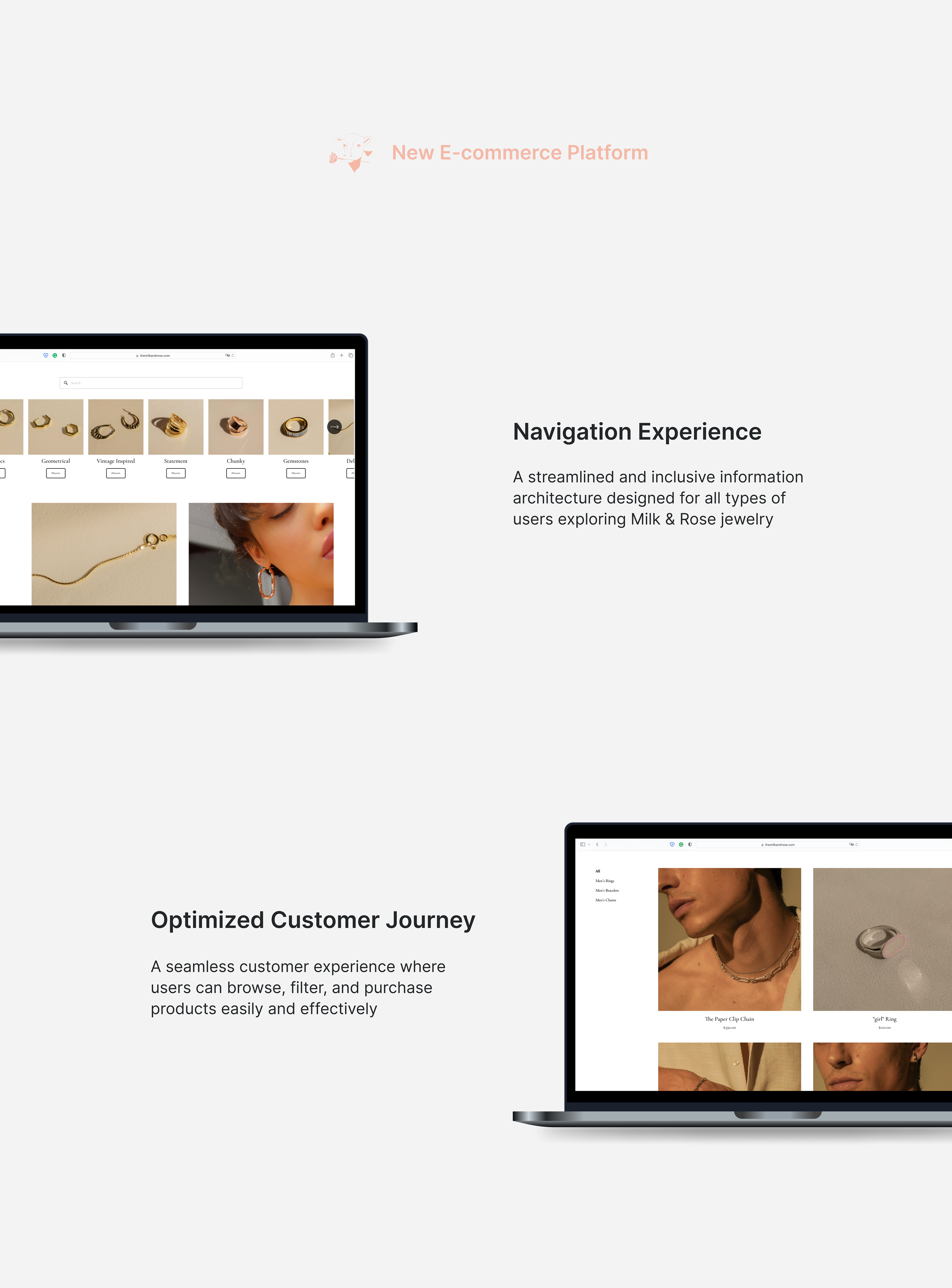
Redefining navigation and usability for a seamless product discovery experience
When I joined M&R as a UX Designer, I was tasked with revitalizing the customer experience of the company's primary website.
Upon joining, the existing website faced significant usability issues, including outdated links, broken images, and inconsistent product information. These issues created confusion for users, especially when navigating a catalog of over 200 products.
As a UX Designer at M&R, I revitalized the website's user experience by addressing issues in information architecture, navigation, and product presentation across a catalog of 200+ items. I streamlined the structure, clarified user flows, and developed high-fidelity designs to enhance usability and align with the brand's aesthetics.
By the end of the project, this redesign established a seamless customer journey and positioned the company for better user retention.
TIMELINE
Oct 2021 - Sep 2022
SCOPE
Information Architecture, User Research, UX Design
DELIVERABLES
Refined Customer Experience, IA, Hi-fi UI
ROLE
User Experience Designer
TEAM
Pelin Cinar/ CEO Founder
Kris Koslop/ Photographer
Kammy Yedor/ Content Journalist
IMPACT
The platform was launched at the end of 2021 and received positive
feedbacks from trial released
Position Statement
Ethical fine jewelry meant for everyday wear ~ Romanticizing Sustainability ~
For Young generations from 25-35 Who enjoy every unique moment on the street of fashion, our Milk & Rose collection is an ideal handmade, sustainable jewelry that provides aesthetic craftsmanship to keep yourself shiny on the NY street. Unlike all other costly heavy jewelry, our accessories are neutral friendly that does not limit to one gender; moreover, tracking back to the material source, it is environment friendly & sustainable
Problem Space
The existing M&R website faced critical usability issues, including a disorganized information architecture, redundant pages, and inconsistent product details across a catalog of 200+ items. These problems created confusion for users and hindered their ability to navigate and engage effectively with the platform. Addressing these challenges was crucial to improving the customer experience and driving business growth.
findings
Identifying key issues impacting the website’s usability: broken links, unclear navigation paths, and inconsistent product information. User feedback revealed frustration with finding specific items in the catalog and navigating between categories, emphasizing the need for a streamlined information architecture and a more intuitive customer experience.

Original Site Map
This site map represents the original web design flow before I joined the team. My first project was to redesign the flow of our main website. The red marker on the site map highlights a broken link and errors that prevents the correct image from being displayed, requiring immediate attention.
Additionally, the circled section identifies one of the most critical areas for improvement. Each category contains over 100 pieces of jewelry, making navigation significantly user-unfriendly and in need of urgent updates.
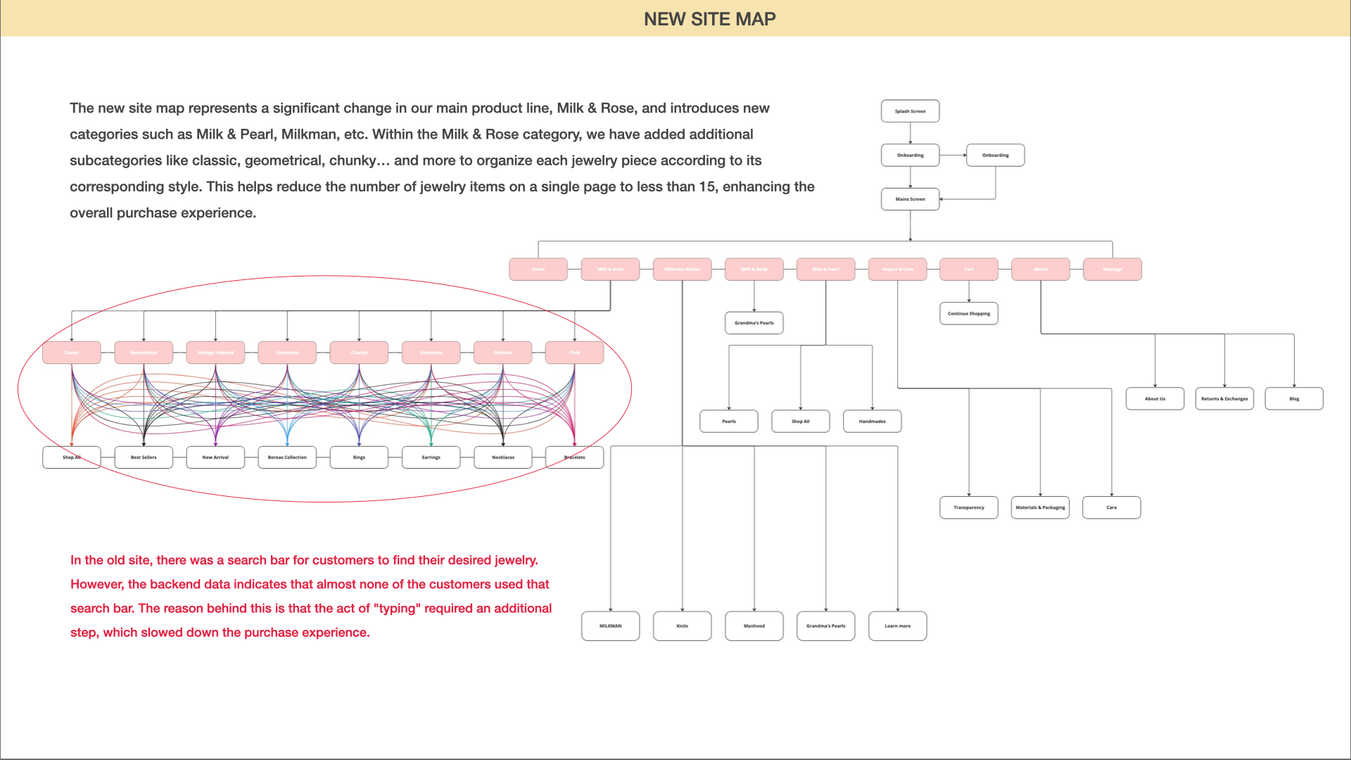
New Site Map
The new site map represents a significant improvement to our main product line, Milk & Rose, introducing new categories such as Milk & Pearl, Milkman, and more. Within the Milk & Rose category, we added subcategories like Classic, Geometrical, Chunky, and others to organize each jewelry piece by style. This restructuring reduces the number of items displayed on a single page to fewer than 15, significantly enhancing the overall shopping experience.
On the old site, a search bar was available for customers to find their desired jewelry. However, backend data revealed that almost none of the customers used it, as typing required an additional step that disrupted and slowed down the purchasing process. Despite this, we decided to retain the search bar for users who prefer a more direct approach to finding specific items, ensuring flexibility in navigation.
01 Design Solution - Menu & Taps for landing page
Redesigned Information Architecture
-> Simplified navigation and minimized steps, allowing users to explore and find products more easily
-> Simplified navigation and minimized steps, allowing users to explore and find products more easily
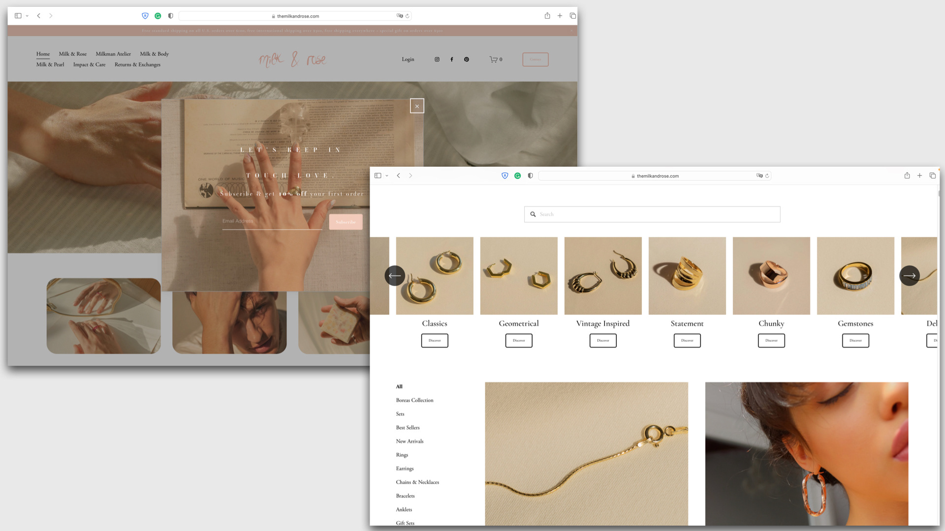
Mega-Menu and Subcategories
-> Introduced new categories like "Milk & Pearl" and "Milkman" to better structure the product offerings
-> Added subcategories within "Milk & Rose" (e.g., "Classic," "Geometrical," "Chunky") to organize jewelry by style
-> Introduced new categories like "Milk & Pearl" and "Milkman" to better structure the product offerings
-> Added subcategories within "Milk & Rose" (e.g., "Classic," "Geometrical," "Chunky") to organize jewelry by style
Optimized Product Display
-> Reduced the number of items per page to fewer than 15 for easier browsing
Retained Search Bar for Flexibility
-> Kept the search bar for users who prefer direct item searches, despite its limited use
Eliminated Redundant Links
-> Removed broken and redundant links to improve overall site functionality
02 Design Solution - Product Page
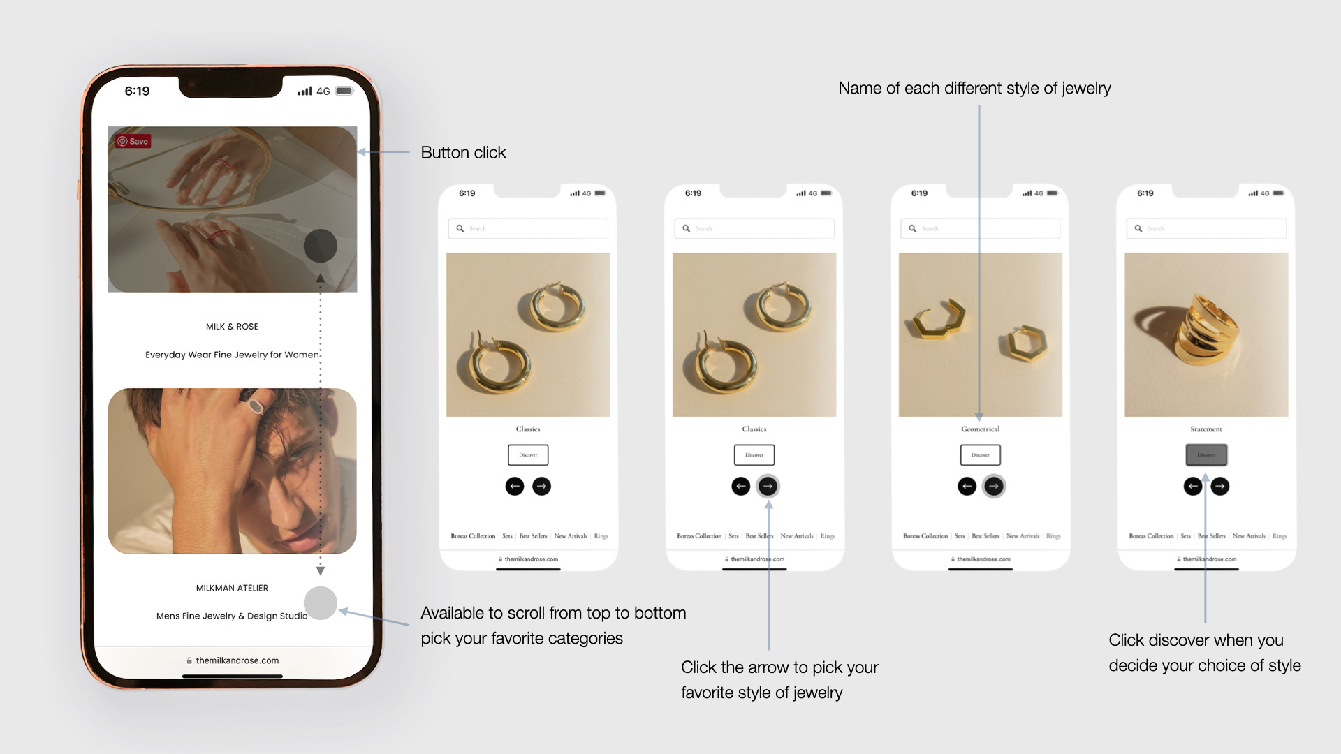
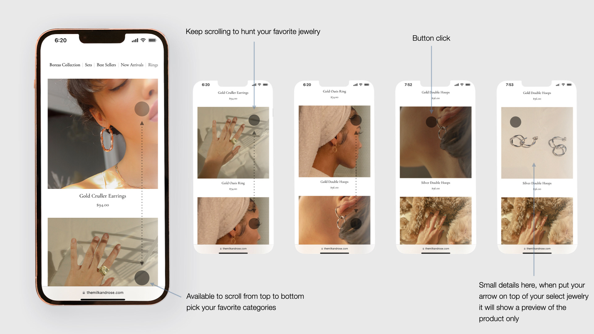
One of the biggest changes in M&R is our product page. The old user interface only has four categories: rings, earrings, necklaces, bracelets, and the rest of the products are all on one page. More than 100+ pieces of jewelry on one page is a bad user experience. After several prototype tests, we decided to give each piece of jewelry a style code and add slides of sections on the main product page to select your favorite style of jewelry. More changes we made here include the main categories on the left-hand side, like Boreas Collections, Bestseller, New Arrival, and more, to help you pick your desired jewelry. These categories make 100+ pieces of jewelry that won’t pop on one page at once but select in small categories and less than 15 jewelry per page for a better experience
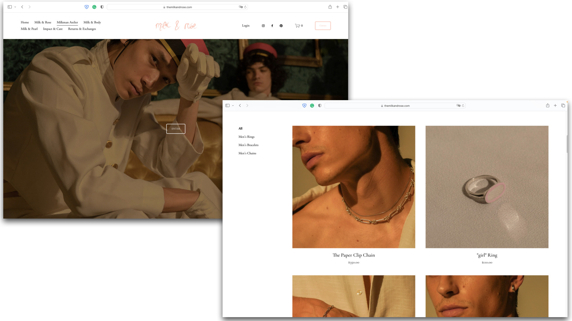
03 Design Solution - Milkman Atelier Page
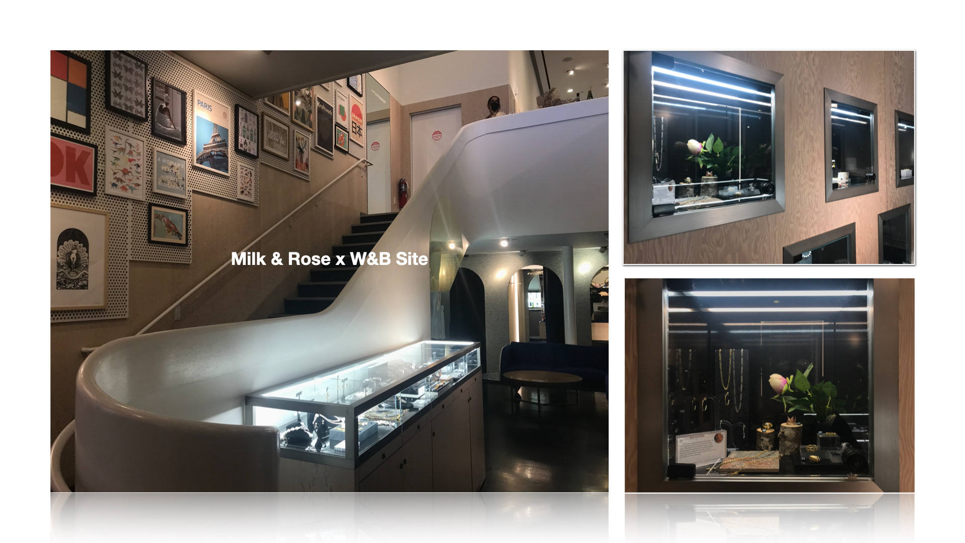
Milkman Atelier page is the new add-on product page for men specifically. The reason for adding a new category is to separate it into a smaller detailed section. Another reason is to extend our product line. In June 2022, we participated Chelsea Flea market in NY and did a quick setup to first-time face to face sell our jewelry to customers. Surprisingly, a lot of our customers are male, and they keep asking us for the update on specific men’s products. In the end, we decided to extend more product lines to males, including pearls and bodies, and receive more feedback from our customer
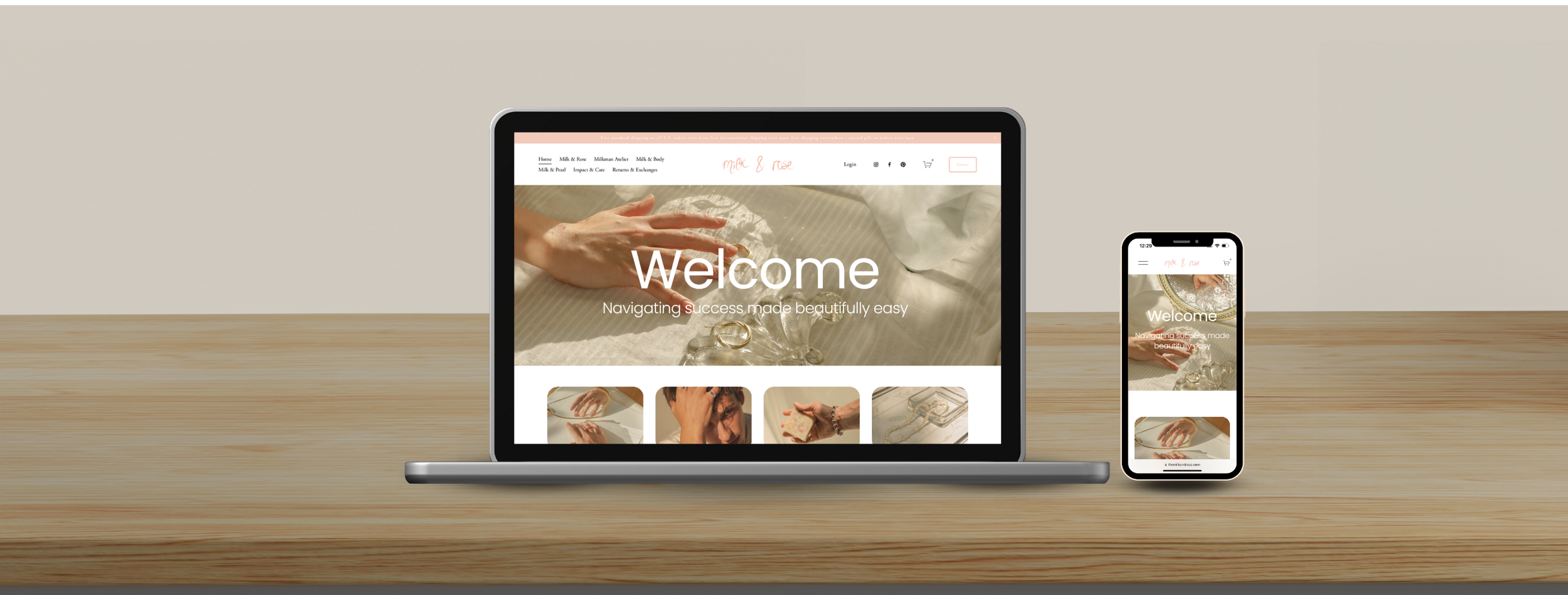
Final Look First Screen Landing Page

Low-Fidelity Wireframe
While the solution focuses on the website, we also need to consider smaller screen sizes
As more users rely on mobile devices for browsing and shopping, we recognized the need to adapt our solutions for smaller screen sizes. Our research and analytics showed an increasing percentage of users accessing our website via smartphones. While the current solutions focus on desktop usability, mobile users may face challenges such as overcrowded screens and difficulty navigating extensive product catalogs. Addressing these issues is essential to providing a seamless and inclusive experience across all devices, aligning with modern e-commerce trends and customer expectations
Selected Wireframe

High-Fidelity Wireframe
Product Page(Filtering)
Product Page(Main)
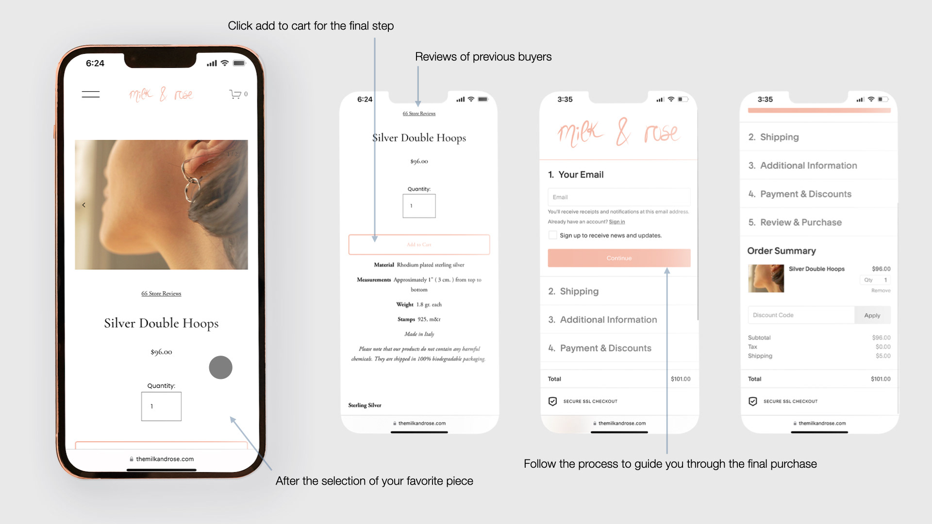
Checkout Page
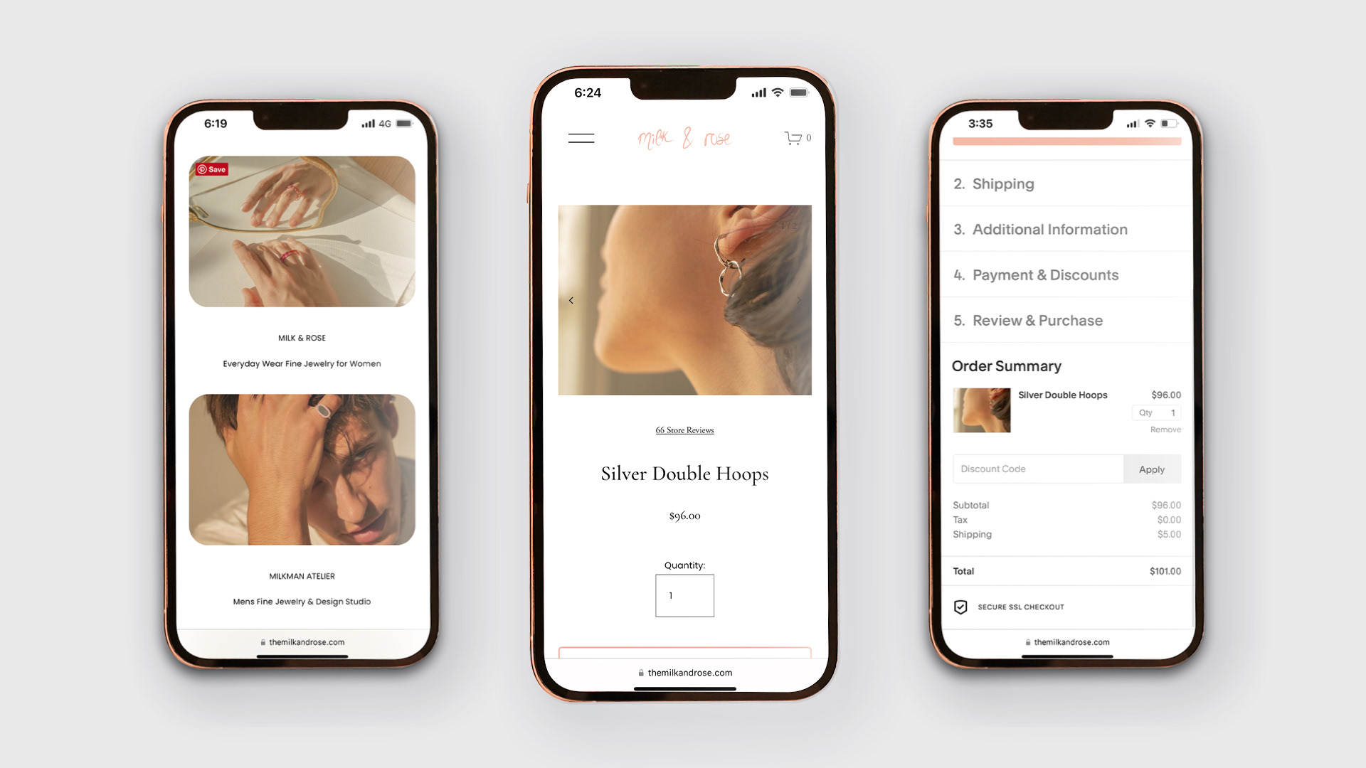
Final Look
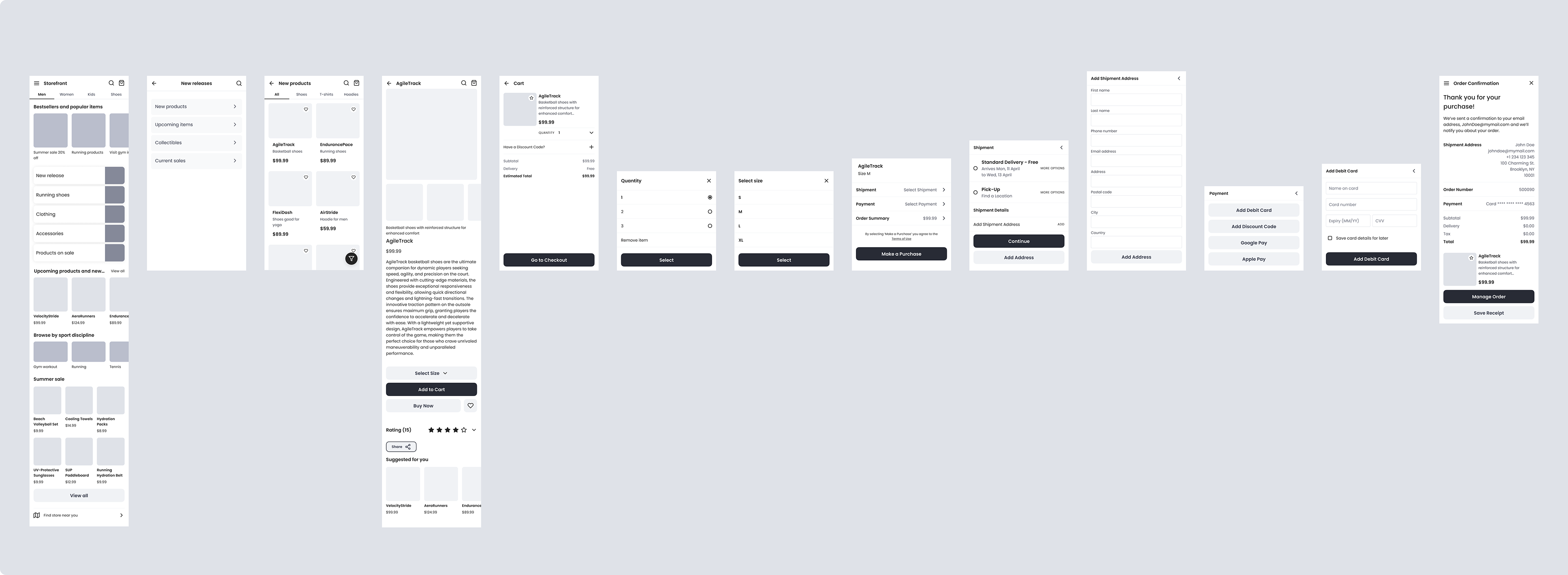
04 Design Solution - smaller screen size(Phone)
The redesigned product page introduces a "Style" carousel, allowing users to quickly filter through jewelry categories without scrolling through extensive lists. I simplified the main entry screen with clear, visually distinct call-to-action buttons for collections, guiding users seamlessly into their desired journey. Additionally, the splash screen, news page, and blog post pages were streamlined to deliver a consistent, minimalistic design that enhances content readability and engagement.
These wireframes established a foundation for high-fidelity designs and were pivotal in aligning stakeholders on a cohesive vision for the app’s new UI, which significantly improved navigation, discoverability, and overall user satisfaction.
Impact
The launch of the redesigned M&R website at the end of 2021 was met with positive feedback from both customers and stakeholders. Users appreciated the intuitive navigation and streamlined product categories, reporting a significantly improved shopping experience. Internal teams highlighted how the updated information architecture reduced customer service inquiries related to navigation issues, saving valuable operational hours
what I've learnt
Prioritize user testing early to refine designs effectively
While I placed significant emphasis on perfecting wireframes, I realized that starting user testing earlier could have uncovered usability issues sooner. In future projects, I aim to involve users earlier in the process, turning feedback into actionable improvements throughout the design iterations.
While I placed significant emphasis on perfecting wireframes, I realized that starting user testing earlier could have uncovered usability issues sooner. In future projects, I aim to involve users earlier in the process, turning feedback into actionable improvements throughout the design iterations.
Balance business goals with user needs
I learned that while creating user-centered designs is critical, aligning with business goals and stakeholder priorities ensures the project’s success. For example, the updated site architecture not only improved customer navigation but also reduced operational bottlenecks—a balance that contributed to leadership recognition.
I learned that while creating user-centered designs is critical, aligning with business goals and stakeholder priorities ensures the project’s success. For example, the updated site architecture not only improved customer navigation but also reduced operational bottlenecks—a balance that contributed to leadership recognition.
Collaborating across teams accelerates impactful solutions
Working closely with developers and project managers allowed me to better understand technical constraints and feasibility early in the process. Frequent discussions and feedback sessions encouraged me to iterate on design solutions quickly and effectively, leading to a smoother implementation and stronger end results.
Working closely with developers and project managers allowed me to better understand technical constraints and feasibility early in the process. Frequent discussions and feedback sessions encouraged me to iterate on design solutions quickly and effectively, leading to a smoother implementation and stronger end results.